MOONLAND
Contact联系
Case 02 · DeepInsight (Ant Group) · Enterprise BI · 2019–2021案例 02 · DeepInsight(蚂蚁集团)· 企业级 BI · 2019–2021

A BI platform for 47,000
analysts who aren't analysts.

给 4.7 万非分析师
用的 BI 平台

DeepInsight is the analytics and insight platform behind data-driven operations at Ant Group and Alibaba. Its users range from BI analysts to product teams building 360° dashboards to operations staff who just need one number. I was the platform's experience designer for two and a half years, working from two directions at once: behavior data to fix what people felt, and a system view to stop the platform from drowning in requests.DeepInsight 是支撑蚂蚁集团与阿里集团数据化运营决策的分析洞察平台。用户从 BI 分析师,到搭建 360 看板的产品团队,再到只想看一个数字的运营小二。我担任平台体验设计师两年半,同时从两个方向推进:用行为数据修正用户的感受,用全局视角让平台不被需求淹没。
Role角色

Senior experience designer · product design高级体验设计师 · 产品设计

Users用户

47.7k MAU · 31.8k WAU inside Ant & Alibaba蚂蚁与阿里内部 MAU 4.77 万 · WAU 3.18 万

Team团队

10+ PMs, 1–2.5 designers, peak 25+ requests a month10+ 产品经理,1–2.5 名设计师,高峰月均 25+ 需求

Recognition荣誉

Ant Luban Award · SUPER MA nomination蚂蚁鲁班奖 · SUPER MA 同心同行提名奖

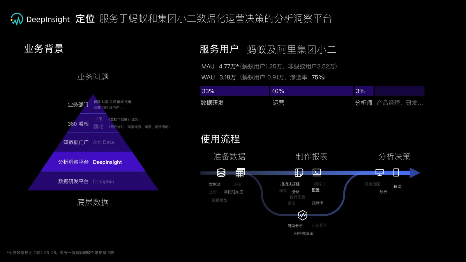
DeepInsight positioning: user pyramid and the prepare → build → analyze workflow
Positioning: one platform, a pyramid of users, and a three-step workflow (prepare data → build reports → analyze and decide).定位:一个平台,一座用户金字塔,三步工作流(准备数据 → 制作报表 → 分析决策)。
The tension矛盾

Power users wanted more. Everyone else wanted less.

重度用户要更多,其他所有人要更少

The business goal was explicit: serve BI analysts and operations staff, support fast 360° dashboard building, and be pleasant to use. The interviews said something harder. Analysts: "If DI doesn't support this chart, we'll build our own." Product teams: "We can't wait, we'll design it ourselves." Operations staff, by far the largest circle on the chart: "Too complex. The jargon is hard. Where is the analysis entry for my product?"业务目标很明确:既服务 BI 分析师,也服务运营小二,支持 360 看板高效搭建,还要好用。访谈里的话更扎心。分析师:「DI 再不支持这些分析能力,我们就不用了。」产品团队:「业务等不了了,我们先自己开发设计。」而在图上圆圈最大的运营小二说:「这些功能太复杂,专业术语难理解,各个产品的分析入口不一致,找不到在哪里。」

The design problem, restated: a single interface that scales from "one number" to "custom analysis" without making either group feel like a second-class user. That cannot be solved feature by feature. It needs data about who does what, and a system that absorbs requests instead of stacking them.重新表述设计问题:一套界面要从「看一个数字」平滑扩展到「自定义分析」,且不让任何一方觉得自己是二等用户。这不可能一个功能一个功能地解决。它需要关于「谁在做什么」的数据,以及一个能吸收需求而不是堆叠需求的系统。

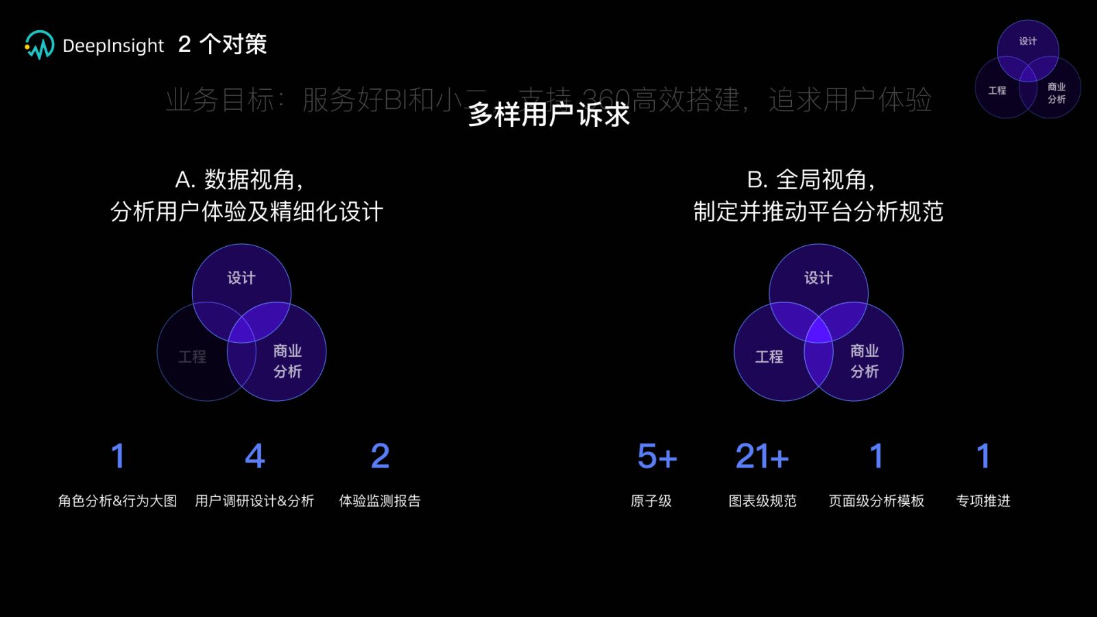
Two strategies: a data lens on user experience, and a system lens on platform analysis specifications
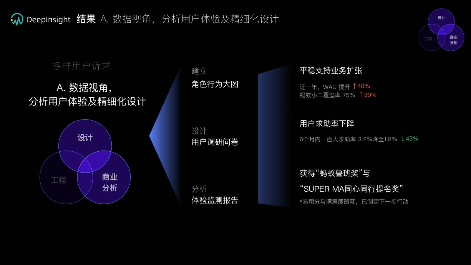
Two strategies, one goal. Left: the data lens. Right: the system lens. Each intersects design, engineering and business analysis.两个对策,一个目标。左:数据视角。右:全局视角。每一个都落在设计、工程与商业分析的交集上。
Strategy A · the data lens对策 A · 数据视角

Design the experience from behavior, not opinions.

行为数据而不是意见出发做体验

01

One role-and-behavior map for the whole product team一张给整个产品团队的角色行为大图

I instrumented and mapped what each role actually did inside the product, from first login to a published dashboard, and turned it into a single shared map. It became the product team's common picture of the user, and the reference for deciding which requests were about a real bottleneck versus a loud voice.我梳理并绘制了每种角色在产品内的真实动线,从首次登录到发布看板,汇成一张全团队共用的大图。它成为产品团队对用户的共同认知,也是判断一个需求究竟是真实瓶颈还是嗓门大的依据。

02

Four surveys designed to be comparable, not just informative四次可比较、而不只是有信息量的用户调研

Each survey used the same core scale for satisfaction and self-reported difficulty, so that results could be compared across quarters and across roles. The point was not to learn "what users want" once; it was to build a measurement that would keep telling us whether the last release helped.每次问卷都使用相同的满意度与主观难度核心量表,让结果可以跨季度、跨角色比较。目的不是一次性知道「用户想要什么」,而是建立一把持续告诉我们「上一个版本有没有帮上忙」的尺子。

03

Experience monitoring reports that feed the roadmap回写进产品规划的体验监测报告

Two monitoring reports translated the data into concrete planning actions: which analysis paths to add guidance to, which configuration flows to simplify, where the help-request spikes were. Engineers got to see how the experience moved, and the design team's proposals carried numbers instead of adjectives.两份体验监测报告把数据翻译成具体的规划动作:哪些分析路径要加引导、哪些配置流程要简化、求助高峰出现在哪里。工程同学看到了体验的变化曲线,设计团队的提案也从形容词变成了数字。

Results of strategy A
+40%
Weekly active users, year over year周活跃用户,同比
75→90%
Coverage of Ant Group operations staff蚂蚁小二覆盖率
−43%
Help-request rate in six months (3.2% → 1.8%)六个月内百人求助率(3.2% → 1.8%)
2
Awards: Ant Luban Award, SUPER MA nomination荣誉:蚂蚁鲁班奖、SUPER MA 提名
Strategy B · the system lens对策 B · 全局视角

Turn 25 requests a month into one spec.

把每月 25 个需求收敛成一套规范

As the underlying analytics platform, DI received requests from multiple business lines, each with its own product managers, front-end teams and data teams. Similar asks arrived in different words. Custom components were expensive and tied to specific data. The platform's experience lost consistency with every one-off. The way out was to stop answering requests one at a time.作为底层分析能力平台,DI 面对多个业务线的需求,每一条线都有自己的产品、前端和数据团队。相似的诉求用不同的话反复到来,定制组件成本高且绑定特定数据,每一次一次性方案都让平台体验更不一致。出路是不再一个一个地回答需求。

01

Decompose page-level requests into atomic needs把页面级需求拆解为原子需求

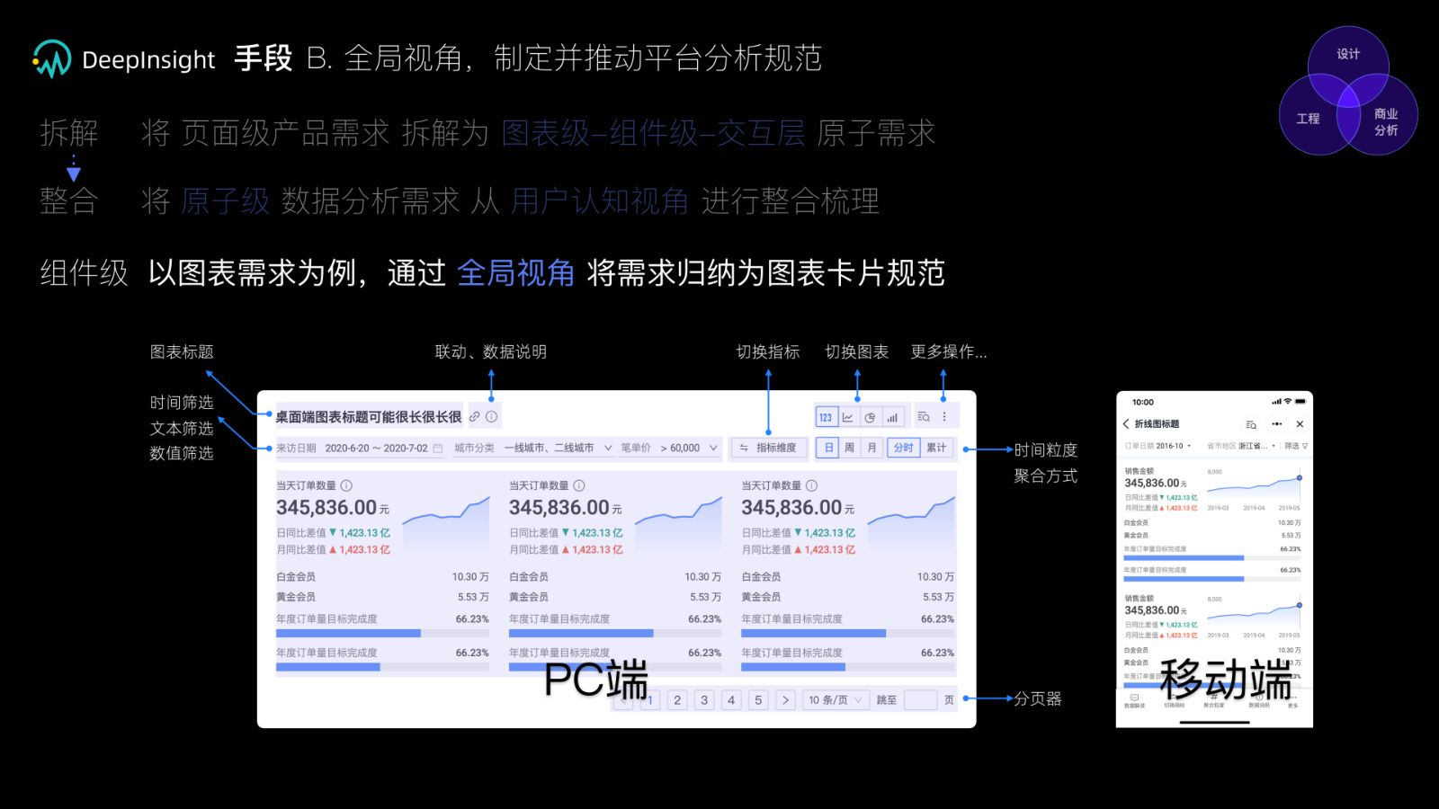
Every "we need a dashboard for X" was broken down into chart-level, component-level and interaction-level atoms. At that resolution, three product lines asking for three different pages were usually asking for the same six components.每一个「我们需要一个 X 看板」都被拆成图表级、组件级和交互层的原子需求。在这个粒度上,三条产品线要的三个不同页面,通常其实是同样的六个组件。

02

Reassemble them along the user's cognition, not the org chart沿用户认知、而不是组织架构重新组合

Atomic needs were reorganized into the sequence a person actually moves through: data → authoring state → reading state → analysis state → insight. Each state got its own requirements (findability and capability while authoring; clarity while reading; comparison, drill-down and linkage while analyzing). Chart-level needs were classified as chart family × analysis purpose × priority.原子需求按人真实经历的顺序重新组织:数据 → 制作态 → 阅读态 → 分析态 → 洞见。每个状态有自己的要求(制作时的可找到、有能力;阅读时的清楚;分析时的对比、下钻与联动)。图表级需求则按「图表大类 × 分析目的 × 需求优先级」分类。

Cognition model: data, authoring, reading, analysis, insight
03

One chart-card spec, PC and mobile, then an eight-month program to land it一套 PC 与移动端通用的图表卡片规范,再用八个月专项落地

Using charts as the first proving ground, I consolidated the atoms into a single chart-card specification: title, filters, time granularity, linkage, metric switching, pagination, and the mobile counterpart of each. I then initiated a visual-analysis program (from October 2020) with a 38-person cross-functional team to upgrade components, chart capabilities and page templates against the spec.以图表为第一块试验田,我把原子需求整合成一套图表卡片规范:标题、筛选、时间粒度、联动、指标切换、分页,以及每一项在移动端的对应形态。随后我发起可视分析专项(2020 年 10 月起),与 38 人的跨职能团队按规范升级组件、图表能力与页面模板。

Results of strategy B
21+
Chart capabilities upgraded图表能力升级
5+
Atomic components upgraded原子级组件升级
3+
Product lines served by one page-level analysis template一套页面级分析模板覆盖的产品线
38
People in the eight-month visual-analysis program八个月可视分析专项的团队规模
Side quest · inclusive design支线 · 包容性设计

If a chart can be prioritized, it can be read aloud.

图表既然能分优先级,就能被读出来

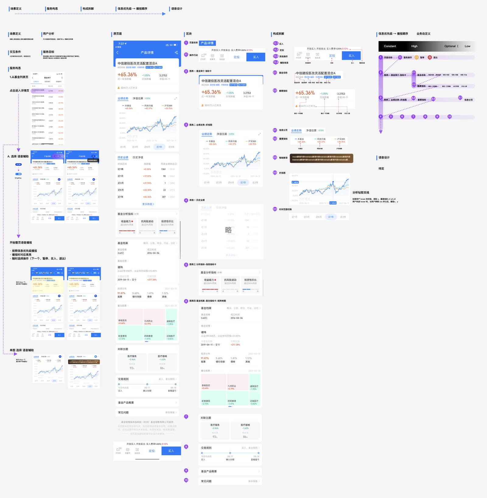
A fund-detail page in Alipay is dense: a headline return, a performance line chart, historical tables, analysis indicators, holdings. For visually impaired users, "read the whole page" is useless and "read nothing" is worse. I took the same decomposition method from the platform work and applied it to accessibility: split the page into blocks, rank every element as constant / high / optional / low, and let that ranking become the narration order. The user can then choose full-page narration, single-chart narration, or jump to a decision (buy, schedule, pause, exit) at any time.支付宝的基金详情页信息密度很高:收益率、业绩走势折线图、历史表格、分析指标、持仓。对视障用户,「读整页」没用,「什么都不读」更糟。我把平台工作里的拆解方法用到无障碍上:把页面拆成区块,把每个元素标为 constant / high / optional / low,让这个优先级直接成为播报顺序。用户可以选择整页播报、单图播报,或随时跳到决策动作(买入、定投、暂停、退出)。

The chart itself got a narration rule too: hover reads x; hold reads x with y1, y2, y3; fast hover samples the trend. Information priority is the bridge between a visual chart and a spoken one.图表本身也有播报规则:hover 读 x,长按读 x 与 y1、y2、y3,快速滑动则抽样播报趋势。信息优先级是视觉图表与语音图表之间的那座桥。

Inclusive chart design: information priority mapped to narration order for a fund detail page

"Serve the business with a data lens and an engineering mindset, and keep pushing design toward the value it can create on its own initiative."「以数据可视化视角和工程化思维,积极推进和探索设计能为商业主动带来的价值。」

Closing line of my 2021 design review2021 年设计述职的结语

Next case下一个案例 AntV — turning chart design from taste into rules →AntV——把图表设计从审美变成规则 →